Financial Firm Intranet

Project Scope:
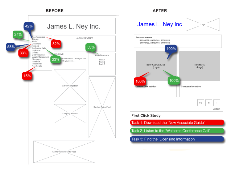
I was charged with the task of making the company’s intranet easy to navigate for both experienced and new associates. When I first arrived at this project, it was a train-wreck. The firm’s solution for making everything “easy to find” was to “put it all on the front page”. Needless to say, this was a design disaster. The home-page was jam packed with every possible link that could be imagined. As a result, new associates had a terrible time finding what they were looking for. New user’s needed to be able to locate and use critical information, that was designed specifically for them, without wandering around the entire site.
Method:
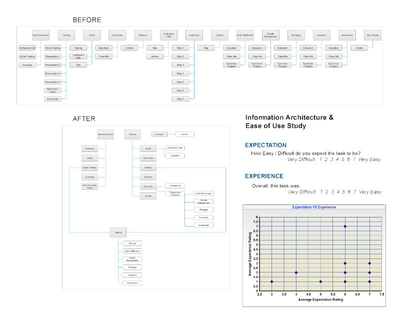
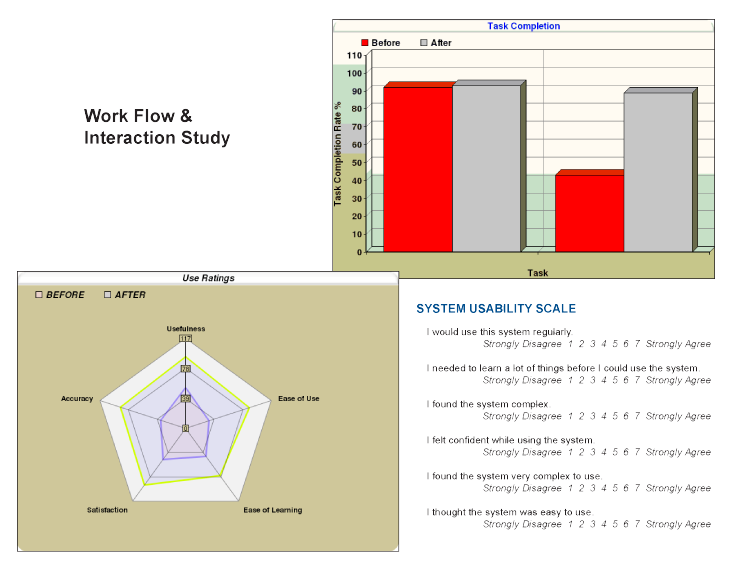
To solve these issues I incorporated a few usability and design tools. These included requirements gathering, site mapping, card sorting, paper prototyping, first click studies, wireframing, usability testing, ease of use studies and information architecture restructuring. Each of these tools were used at different times, and multiple times, throughout the agile process. The changes in the below diagrams allowed the team to re-route each user into two distinct very clear paths.
